The 2.3.0 release is quite exciting as it introduces an "AI Helper" to the "What You See Is What You Get" (WYSIWYG) editor of the Platform.
Main features:
AI content editing
This is done via an API. The most obvious route to get this up and running was to use OpenAI's ChatGPT, but in the future it should be possible to use compatible alternatives such as Mistral AI or PrivateGPT.
Currently, the functionality can:
- Rewrite copy to make it more concise.
- Rewrite copy to elaborate it.
- Rewrite copy to make it easier to read.
- Rewrite copy to fix spelling and grammar issues.
- Rewrite copy to change the tone.
- Translate copy.
- Generate copy on a given topic.
The aim isn't to do away with the need for content editors, but rather to empower them to get more done. You can think of the AI integration as a junior sub-editor, but it returns the answer in seconds. It is in no way a panacea, but you can give it feedback, and still use the undo and redo buttons of the editor, so with a few prompts it can get close to what you want it to do. At this point manual content editing is needed to finalise content.
Improvements:
An accessible carousel
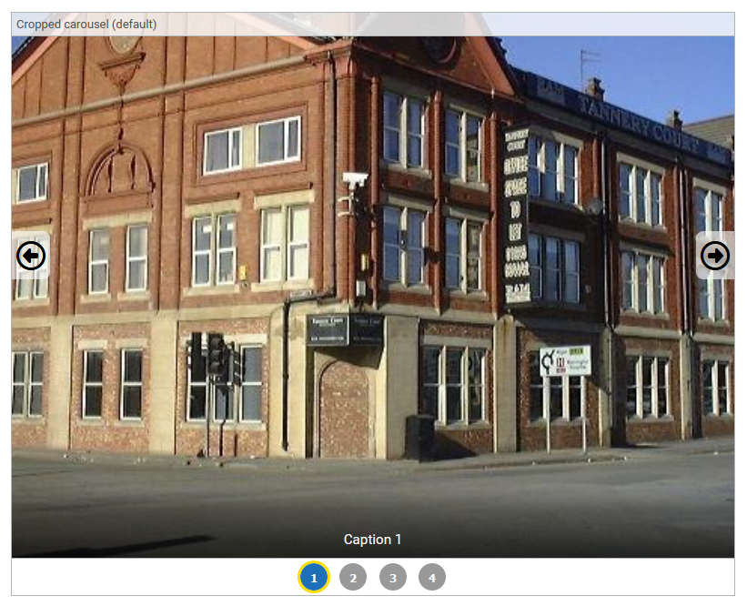
This delivers a request by Brentwood Council. The existing "Gallery" WYSIWYG component is limited in its ability to display lots of images without having to compromise on either the individual images being very small or the overall gallery taking up a very large amount of space on the page. A carousel is a means to solve this. Carousels have a bad reputation from a usability and accessibility perspective, as explained at https://www.smashingmagazine.com/2022/04/designing-better-carousel-ux/, but that is because they are often misused to try and cram content into the top of pages. For some use cases though, they do work, such as previewing a product or bookable experience. In this situation, users want to see large images while still being able to navigate between them back and forth. We've adopted Web Accessibility Initiative guidance to extend the existing gallery component to offer a "carousel" style, ensuring it is accessibility legislation compliant.

Collapsible search facets on Directories
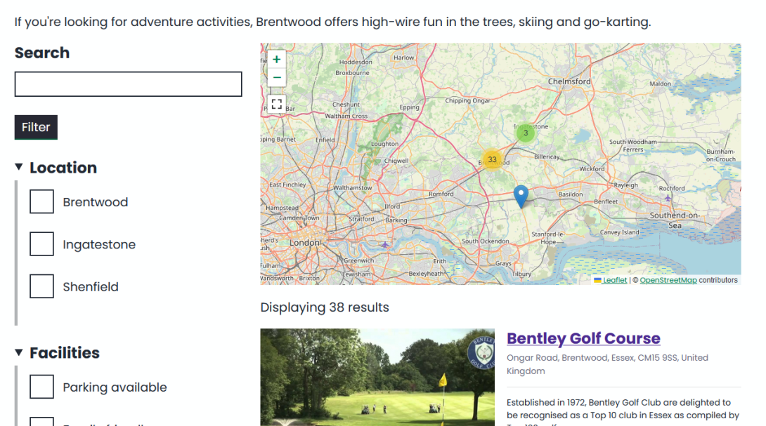
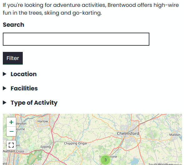
Another request by Brentwood Council. Brentwood use Directories extensively for their Brentwood Connected site. They found that when these pages are loaded on mobile devices, users had to scroll past lengthy search filter user interface components before they could view the list of results. To improve this user experience, we've made the search filters on Directories "collapsible", behaving like the GOV.UK Design System's "Details" component. On Desktop and Tablet devices the filters are open by default, but on mobile devices the filters are closed by default.


Improve the "vertical rhythm" of the WYSIWYG editor
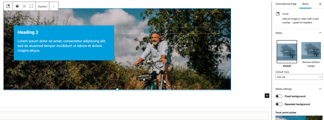
Whilst building a new site for Invest Plymouth, we found that it was difficult to maintain consistent spacing between some permutations of WYSIWYG components. We've updated a number of WYSIWYG components to have a "Remove bottom margin" style, which removes the default 20px bottom margin from the component. We've also updated the Platform's theme so that the default 20px bottom margin is a variable which can be overridden globally and also on a per component basis. This is useful when you want a site to have a more "spaced out" visual appearance.
