The 2.5.0 release is out and already in production usage on client sites!
Styling support expanded
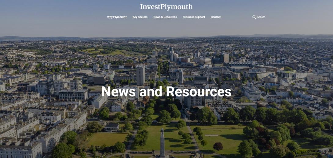
Previously, page headers for Platform sites had opaque backgrounds, but now site owners can change the default theme's behaviour to use a transparent background for the page header instead. This can be combined with full-width image or video banners to overlay text on media with a gradient, increasing readability and appeal.

This can be seen in action on the recently launched Invest Plymouth site.
Rounded corners have also been added to several WYSIWYG components, expanding on work done in the 2.4.0 release. Custom colour palettes used by sites have been expanded and standardised, and font size overrides added to give site owners greater control of the visual appearance of pages.
Other improvements
- Accessibility issues flagged by routine scans have been resolved in order to ensure sites built on the Platform continue to meet UK accessibility legislation. A good example of this is the site of Plymouth City Council, which scores 98.3% WCAG 2.2 AA compliance in a recent audit by Silktide.
- The Media & Text WYSIWYG component has had its styling expanded so that the two columns can overlap:

- A horizontal layout has been added to the Embedded Content WYSIWYG component:
